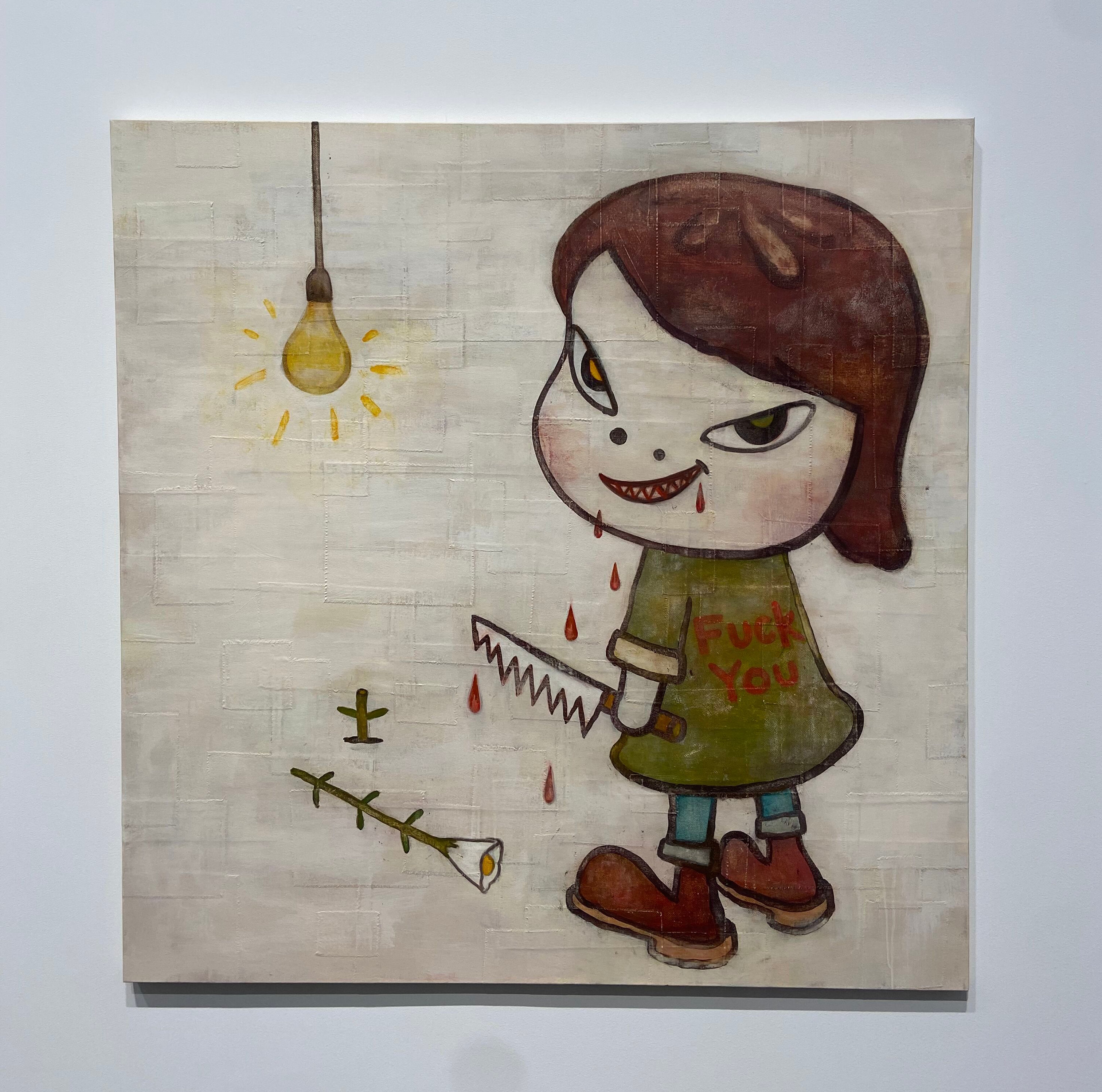
I had the pleasure of going to the opening of Yoshitomo Nara’s newest exhibition of works at David Zwirner gallery in Chelsea. You’ve probably seen a ton of Nara’s work before, but never known the artist behind them: paintings, drawings, prints, and trinkets of angry, sweet, or sad cartoonish little girls with a lot of whimsy. This was the case for me too– up til about three quarters of a year ago. Nara’s fame is one that goes beyond name, and his recognizable style and approach to his work is solid. This was displayed through the length of the line(s) which wrapped each of the two blocks that had spaces dedicated to the paintings, drawings, and sculptures that were on display for this show. As an art appreciator, artist, and art writer, this was, as my friends called it, never-before-seen-levels-of-motion (that I would love to achieve, one day). But when I got inside the gallery, I understood why.
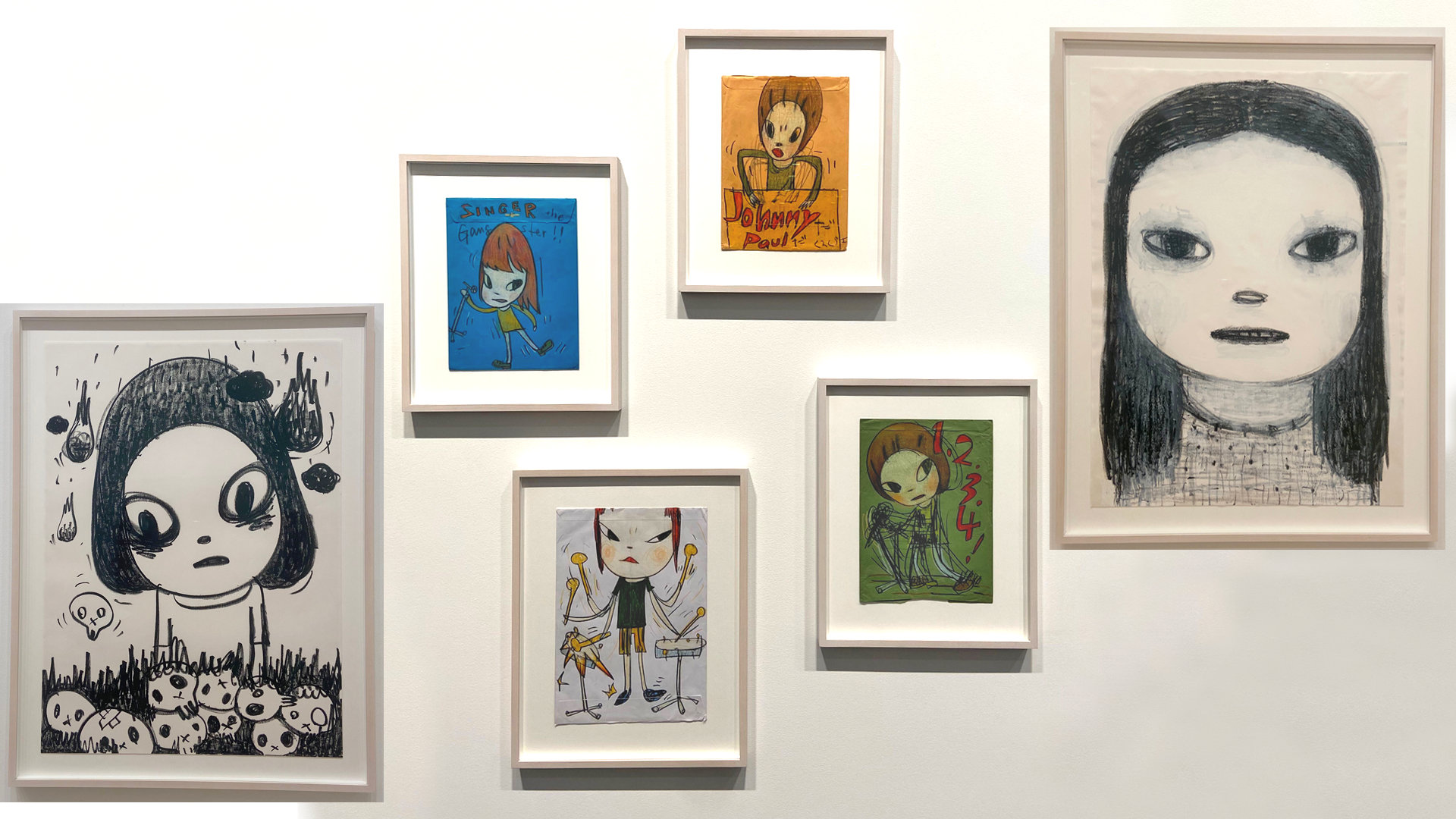
Nara’s works are excellent, and precise, capturing themes of childhood, war, music, and death in illustrations of the cutest characters you’ve ever seen. Before this, the only time I’d had the opportunity to see one of Nara’s original works was by accident, grabbing a drink with some of the 20XX team at Niagara in East Village, where they have one of his drawings done directly on their wall. Other than that, everything else was online, or a print hung up in someone’s home or studio. The experience of the actual pieces is vastly different (as I feel is the case with most art), one of the main reasons being the size of many of these paintings and drawings. Some of these paintings are very big, and the fine, soft details that are common in Nara’s work become more apparent to those with keen eyes.
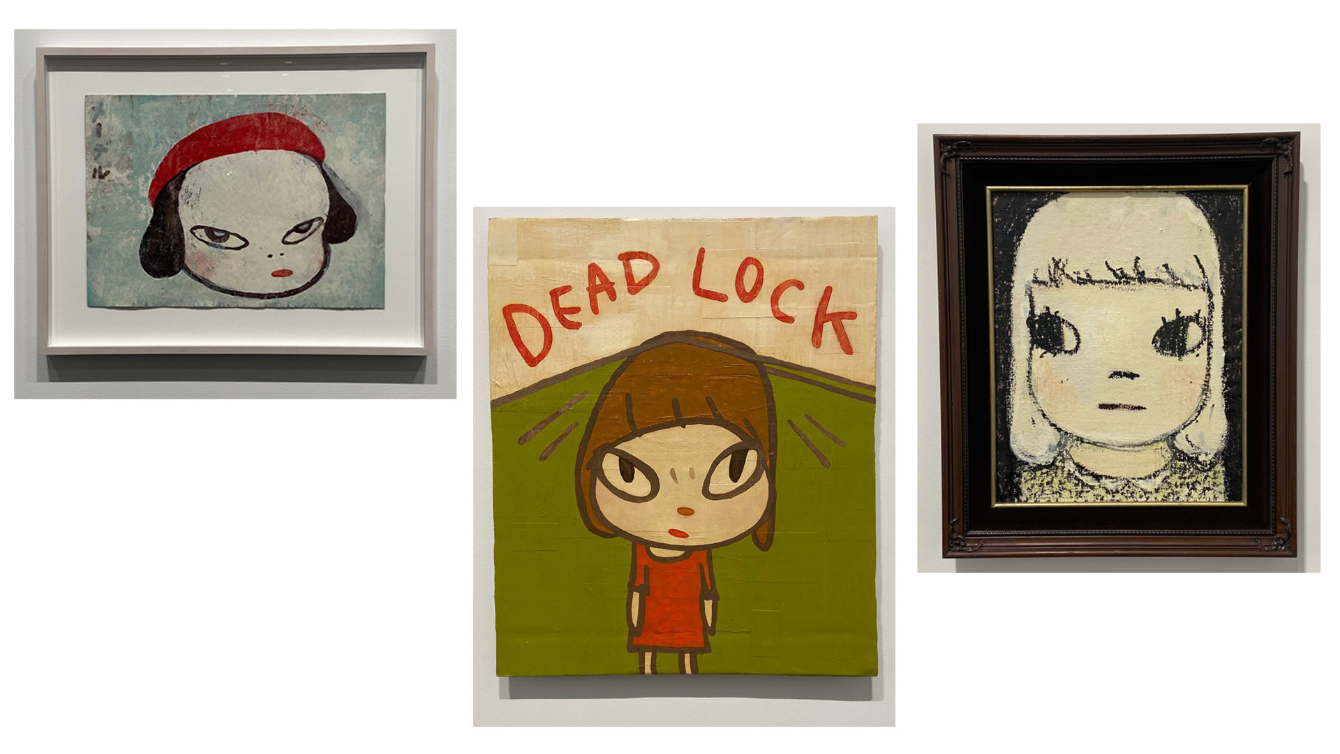
One thing I love to do is get close to a piece, just enough before a snobby, tired museum or gallery guard tells me to step back. I like to see technique come through a piece; how did the artist make this? What were the steps, the brushstrokes, the pencil lines, that brought us to the full piece I’m viewing? Yoshitomo Nara’s style is one that I would describe as very gentle, as far as his paintings go. The way the cheeks of the characters have a slight rosyness to them, and the silhouettes of the hair and shadows seem to fade into the haziness of the background and skin tones, is really something to marvel at. Even though these are cartoony characters, with huge eyes and big round heads, they feel lifelike and real, like they’re in the room with you.
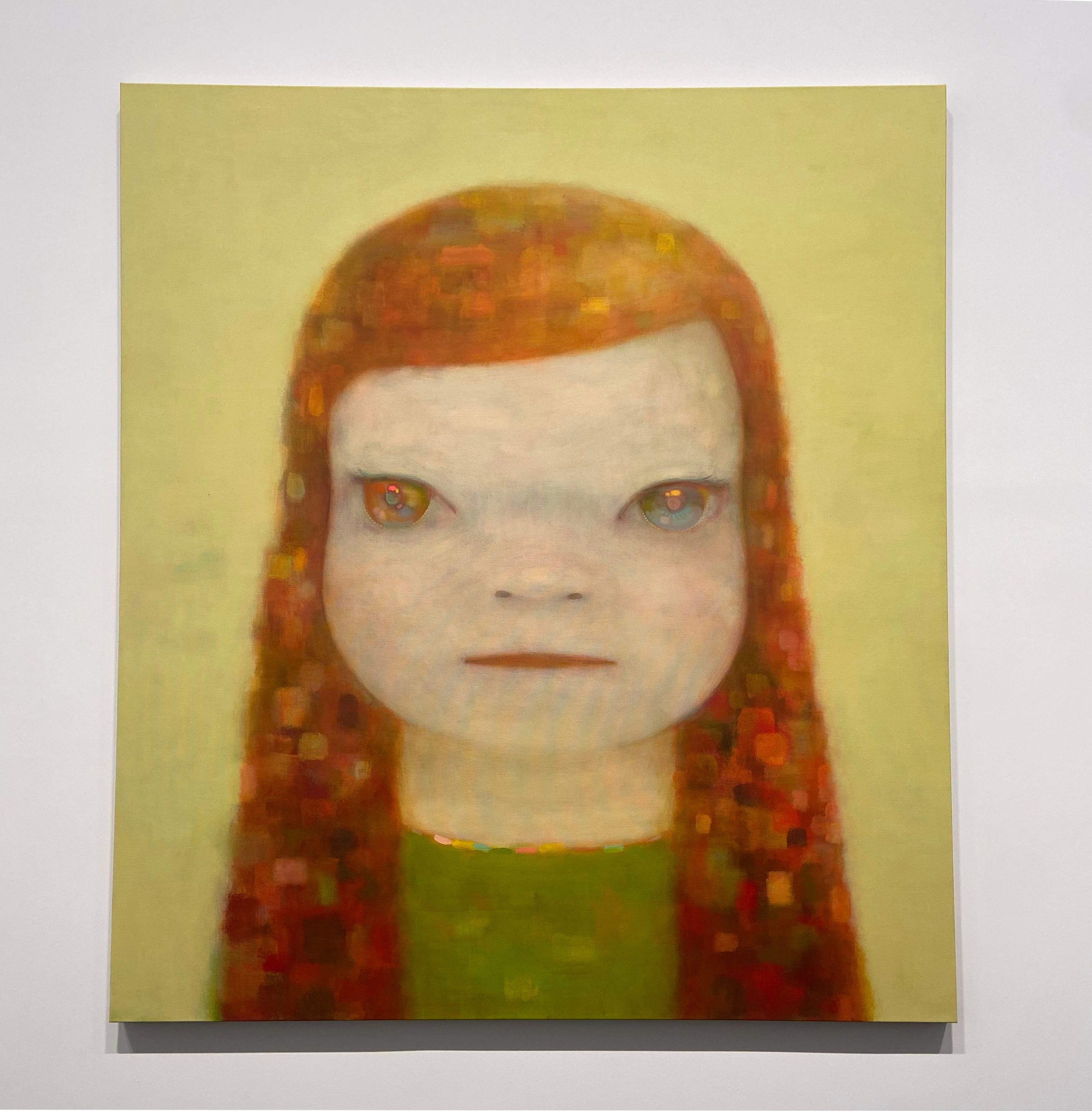
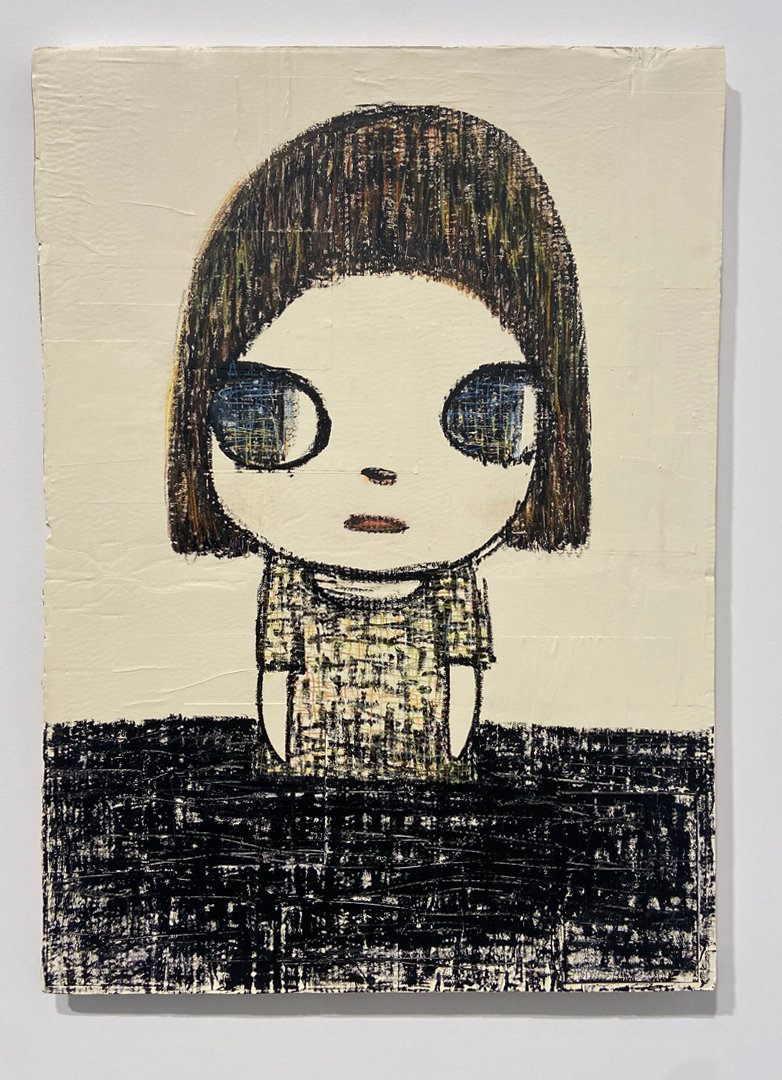
Two pieces that I really enjoyed, both with distinct styles that capture this well are Riverside Girl and Matryoshka. Pictures that you may view online don’t capture the subtlety of color that bring these to life. The gallery experience enhances the viewing of both, allowing you to really sit with the pieces and appreciate the fine details. What’s lit about art, to me, is the intention that goes into every color, material choice, and placement of a brushstroke or line–something that is communicated to me in Riverside Girl and Matryoshka.
One gallery assistant explained to me the significance of the placement of some pieces too. I had asked about one that was mounted closer to the ground, and she told me that Nara’s intention was for it to be viewed easier for children, and to even give the impression that a child mounted the piece themself. The childlike motif comes out beyond the artworks themselves, making the experience of viewing it part of the theme. Another nod to Nara’s intentionality with each part of this exhibition.
As of my writing this, I haven’t gotten the chance to see the sculpture portion of the exhibition, which was in another space the block over. I’ll definitely be heading back to check that out, and probably get another look at the paintings and drawings, on a less busy day. Make your way down to David Zwirner gallery in Chelsea before December 12th to experience Yoshitomo Nara’s lifelike whimsy in person for yourself.